Design Custom Panels in Blocks
Blocks lets you create custom panels for the action bars in your widget and its elements. When a site builder clicks an action button (for example, the Settings button), a custom panel opens, instead of the default panel.
When you create custom panels, you give site builders more options for working with your widget, adding to its usability, and helping them to customize it more easily on their site.
Creating your panel has three main stages:
1. Design your panel, as described in this article. Use our UX guidelines to make your panels clear and effective.
3. Connect your panel to an action button.
2. Add code to your panel to make it work.
Create your panel
First, go to the Editor Experience panel to create a panel.
- をクリックする。 Editor Experience
 icon.
icon. - Click the Custom Panels tab.
- Click Create New Panel.
Add elements to your panel
Your panel is built of panel elements, such as buttons, dividers, input fields and more. Before designing your panel, read our UX guidelines for custom panels.
Click + Add Element and select which elements you want to add to your panel. You can add the same element as many times as you need. Then, you can customize the label text and style, and set defaults and values.
Customize your panel
You have several customization options for the elements in your panel. You can change label text, add tool tips, set defaults and values. You do this by using the action bar connected to each element.
Settings options
Click on an element. Select 設定 or the  icon to customize your panel. Here are some of the options:
Add field titles (see more)
Fill in the Field Title field provide a label for your element (for example, in the following image, Fill Color & Opacity and Border are labels). To remove the label, delete the text.

Add tooltips (see more)
Write some text in the Tooltip Info box to add an info icon with a tooltip containing additional information for site builders who install the widget. To remove the info tooltip, delete the text in the field.
Define element as "read only" (see more)
Toggle on Read only so that the user can only see and copy the text inside, but cannot type in it.
Set initial text options (see more)
An input field in a panel may appear empty, or may contain initial text in several forms:
- Default text: The input field appears with default text.
- Placeholder: The input field appears with a message in a light shade (usually gray), which says what the user should type there and disappears once they start typing.
- Both: The input field appears with default text, but if the user deletes it, they will see the light placeholder text.
Add pattern validation (see more)
Toggle to enable regex (regular expression) to apply additional criteria whenever the field is validated. Use the edit box to enter and edit your regular expression.
Multiple choice elements
If you choose to add an element that has multiple options, like check boxes, radio buttons or dropdown lists, you can configure them by using the manage choices button in the action bar that appears when you select the element.
Rename choices (see more)
Click Manage Choices to open a pop-up with the list of the choices in your element. Double click the choice you want to rename and enter the new name in the field box. You can reorder your choices using drag and drop.

More Actions (see more)
クリック Manage Choices, hover over the choice you want to edit and click the その他のアクション  icon, to set defaults, edit values, and move or duplicate elements.

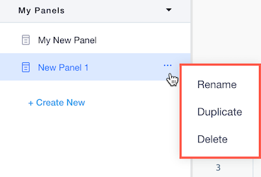
Name your panel
-
Hover over your panel name in the Custom Panels section .
-
をクリックする。 その他のアクション
 icon when it appears.
 -
Select Rename.
-
When naming your panel, note that this name is visible to users. See our UX guidelins for panel texts.
-
You can also duplicate or delete your panel if needed.
Connect your panel to an action button
After creating your panel, you must connect it to a button in the action bar of a widget or an element.
- をクリックする。 Editor Experience icon.
- Click the Configuration tab.
- Select the desired widget from the Widgets panel.
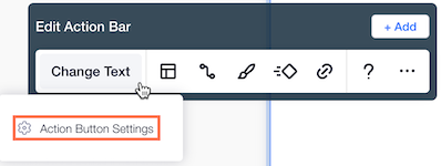
- Hover over the button to which you want to connect your panel, in the Edit Action Bar menu that appears. For example, if it is a settings panel, select the settings button. If it's a design panel, select the design button. You can also add a new button, name it and connect it to a panel.
- クリック
 Action Button Settings.
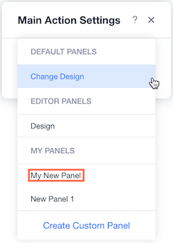
5. Select your panel from the Custom Panels section.
Now that you have designed your panel you need to add code to it to make it work.