Configure Display Names and Behavior in Blocks
The Configuration tab in the Editor Experience panel enables you to decide how your widget and its elements look and behave when they're installed on a site. Make sure to check out our UX guidelines for Configuration.
Widget and Elements Display Names
There are lots of ways you can help site builders get the most out of your app. Giving the elements in your app a display name makes it clear to site builders what each element does. You can also decide how they use different elements, and give them design options.
If you don't define these display names, your widget and its elements will have default display names like "widget" and "button". They will also have default Velo IDs, such as "#widget1" in the Properties and Events panel.
Setting a display name for a widget or element
When you design a widget, you want the site builders who install it on their site to understand what it does. You also want them to be sure about what each of the widget's elements does.
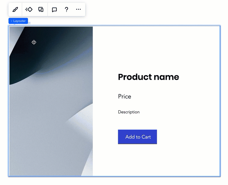
For example, you can make sure that your widget is called "Single Product" and that one of its buttons is "Add to Cart".
To set the display name:
- をクリックする。 Editor Experience
 panel.
 - Click the Configuration tab.
- Select the correct widget from the Widgets panel on the left (if you want to name a specific element inside the widget, select it).
- をクリックする。 Inspector
 icon in the top right corner to expand the Inspector panel, if it isn't expanded yet.
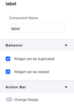
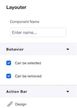
 - Insert the new display name under Component Name.

See how it looks on a site
Configuring widget or element behavior (selectable, removable, duplication and resize)
In some cases you might want to control the way the widget or its elements behave:
Widget behavior:
- Can be duplicated: You might want to prevent your widget from being duplicated by copy and pasting, (for example, if it's connected to dynamic pages and duplication might trigger conflicts or break code). In this case, uncheck this box.
- Can be resized: You might want to prevent a widget from being resized, for design reasons.
Element behavior:
- Can be selected: You might have organized all of your widget elements in a flexbox element, for design purposes. But when someone installs your widget on a site, you don't want them to touch the flexbox - because you want the design to stay as it is. In this case, uncheck this box.
- Can be removed: Some elements might be crucial for your app logic. For example, an Add to Cart button. You would probably not want a site builder to remove it from the widget. In this case, uncheck this box.
Configuring a widget's behavior
- をクリックする。 Editor Experience panel.
- Click the Configuration tab.
- Select the widget from the Widgets panel.
- Select or un-select the checkboxes Widget can be duplicated そして Allow widget to be resized in the Behavior section of the Inspector
 panel (if you can't see the Inspector, click on the
  icon to expand it).
Configuring an element's behavior
- をクリックする。 Editor Experience panel.
- Click the Configuration tab.
- Select the element you want to configure.
- Select or un-select the checkboxes Can be selected そして Can be removed in the Behavior section of the Inspector panel (if you can't see the Inspector, click on the icon to expand it:
備考
- The changes you make when you are in the Configuration tab impact all design presets.
- In the Configuration tab, you can also modify the action bars connected to each element when your widget is installed on a site. Learn more about modifying action bars